Musthouse srl / Logo & Corporate Design
About
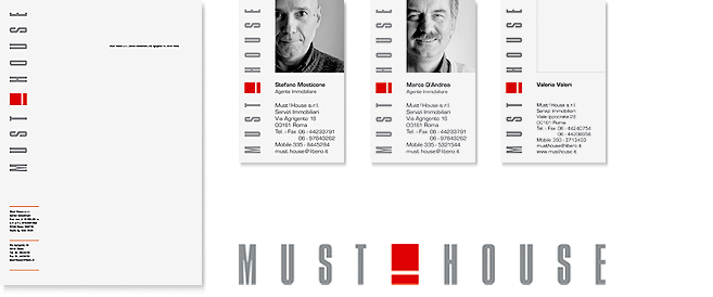
An abstract exclamation point was placed in the middle of the company’s name as a design element and eye catcher. By dividing the name, the symbol emphasizes the topic “house” and gives the name a new meaning. Furthermore, aided by the distinct, uncomplicated typography, it visualizes the topic “constructing/building/house.”
Business cards with photos draw the attention to the contact persons, making them easy to remember.

