fröhlich+ consulting – consulting in the tourism sector / Logo & Corporate Design
About
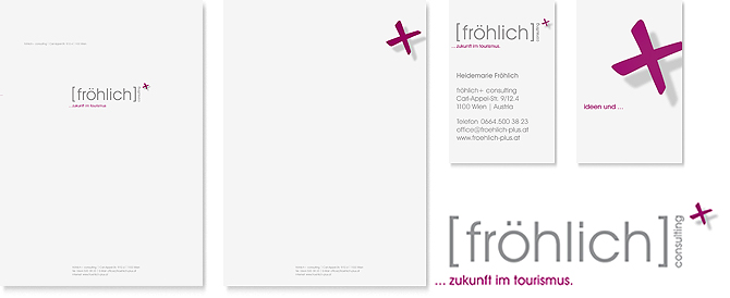
The logo visualises the company name as a formula and motto (representing success). As an eye-catcher and a dynamic element, the plus sign creates a sense of anticipation set against the rather static and businesslike typography. The colour scheme takes a deliberately different approach than that suggested by modern shades, the deep purple shade reminiscent of a blackberry attracts attention and creates a contrast to the staid and elegant grey.
The plus sign is also used in corporate communication and the ad media as a featured element. Alternating slogans (… future in tourism, … ideas in tourism, … opportunities in tourism, … possibilities in tourism) further specify the company’s focus.

