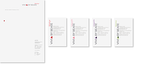
Vivia by Beate / Logo & Corporate Design
About
Four different logotypes, symbolizing the four seasons, in which the human and his skin have different needs, are surprising in a positive way. The main logo of the studio, version red with the big flower, stands for the summer, version violet with the blueberry for the autumn, the fresh green version with the leave represents the winter and version rosa with the small flower the spring.
Vivia by Beate introduces itself with four different business cards in an unexpected and positive way.
